


Role: Lead UX and Visual Designer
B&G Foods, who owns Ortega, came to us because the current Ortega website was out-of-date, hard to update, and they needed a new look. We created a site that is fresh, bold, and colorful, and serves to highlight the innovative products and delicious recipes they offer.
Ortega needed a way to make sure that their new products, like their new Good Grains taco shells, were getting seen by their users. We built them a dynamic featured product module that could be placed in several spots around the website to drive traffic to those new products. We also built them some bold new recipe pages to feature their mouthwatering food photography, and a fun Cinco Day countdown for the homepage, which counts down to the 5th of every month, and then celebrates with a mini-party of confetti!
I worked as Lead Designer on this project, responsible for the UX and visual design of the entire site.
Check out the site at ortega.com
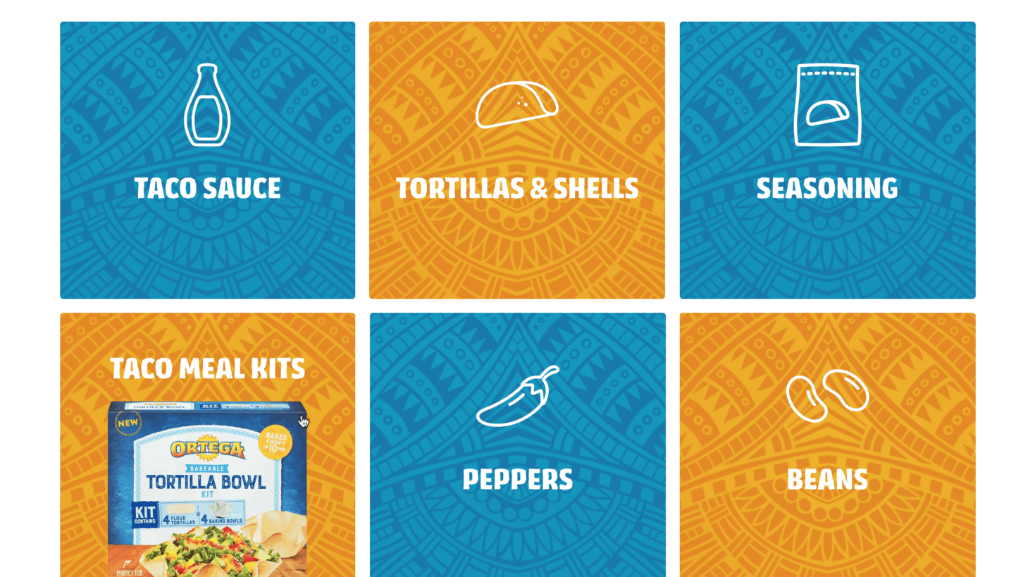
Ortega has a lot of products, and they also have a lot of categories for those products. I was responsible for the entire UX flow and visual design of the Products section. I worked with the developers to understand our filtering and search capabilities, and then worked on getting the user flow down.
Because there are so many categories, we had the main Products nav item lead to an overview of all the Product Categories, where I designed animated icon and image squares. Each image that animates in on hover gives the user an idea of what kind of products they will see in that Category. And from a client point of view, they were able to put their flagship products as the hover, to help get more exposure and more brand recognition.
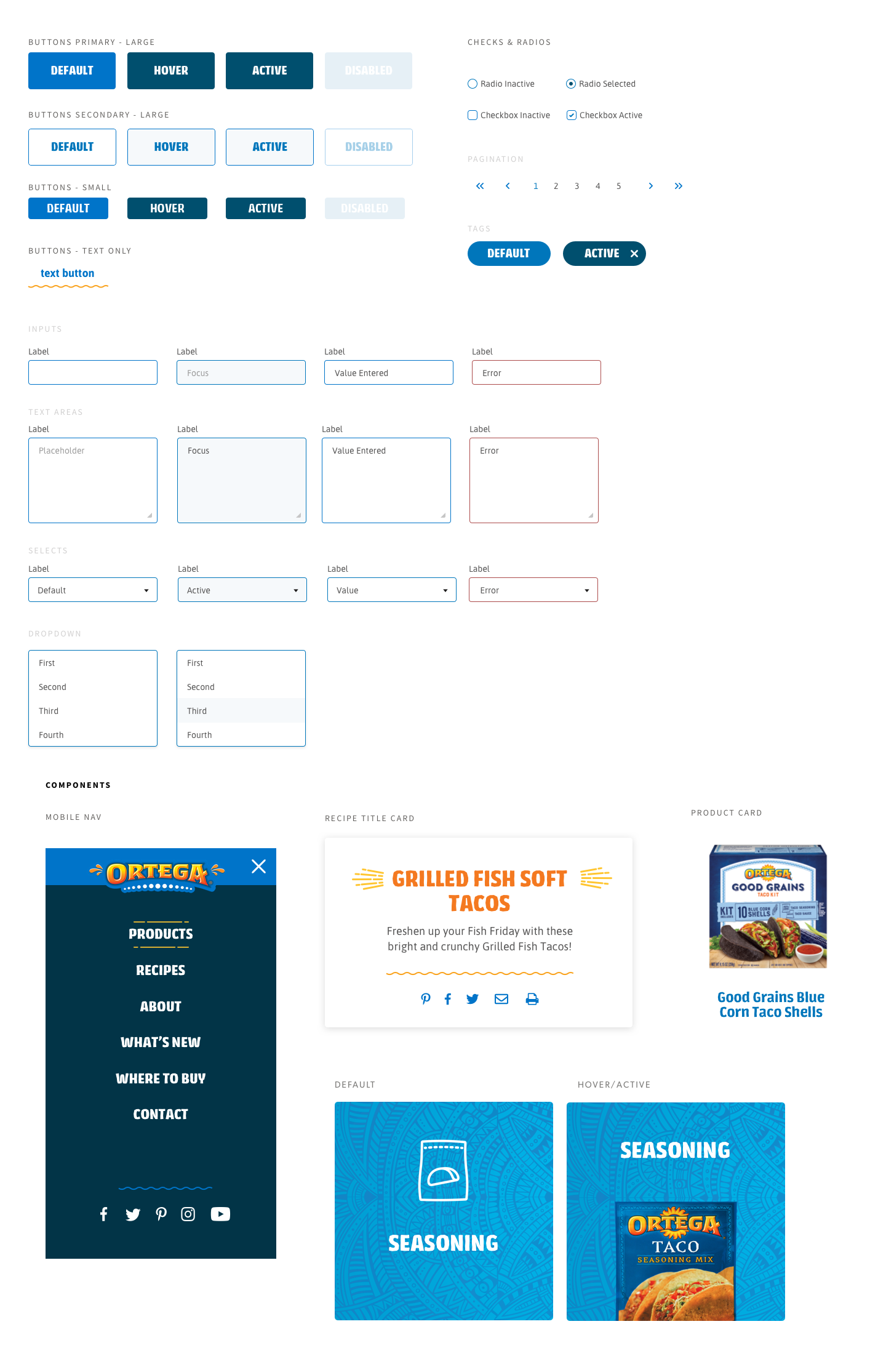
Once the user chooses a category, they are taken to a filtered view of the items in that category only. But they needed to be able to easily switch to other categories, to search, or to view all the products on one page, so I designed a product filter navigation at the top of the page. The filter brings in the same icons that I used on the Category blocks. In mobile, the filter nav transitions to a horizontal scroll, so the user can still see all the icons.
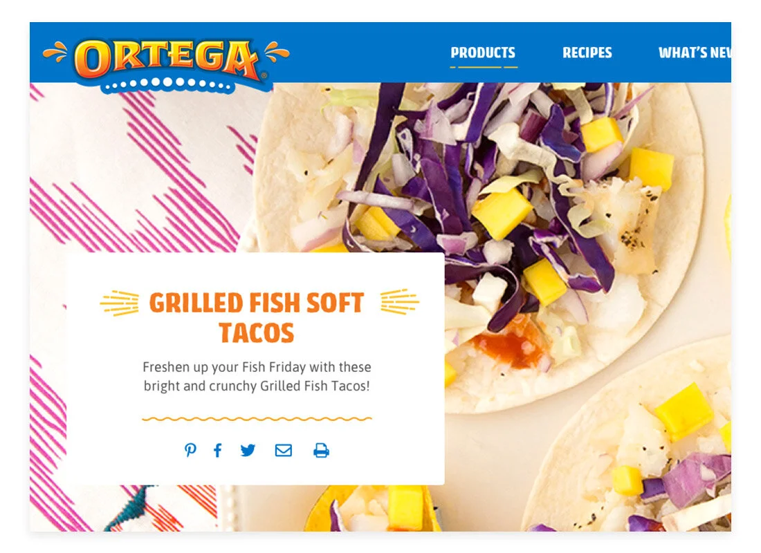
Blue Chip produces a lot of great recipe content for Ortega’s social media accounts, and with this website redesign, we wanted to utilize all the great food photography we had.
Recipes and food blogs are such a huge draw for users these days, so I started by doing research on what kinds of recipe page designs were out there. One advantage we had, especially compared to other big brands, was this very big and beautiful Ortega-specific photography. So I designed a recipe page layout that featured the images very large and bold, with lots of appetite appeal.
I designed a title box to overlap the image, to give us the freedom to run the image almost as big as the user’s entire viewport, while still keeping them grounded in their location and informed of what recipe they were viewing.