


Role: UX and Visual Designer
CUBE is a Content Management System developed by the web team at Blue Chip Marketing. It was built to offer our clients a single powerful platform to manage their content.
This project was originally conceived by the development team and they had built a very early version of it. They quickly realized they needed to get UX involved to help streamline the user flows, as well as the visual design.
We began by evaluating the existing UX and started mapping out the different workflows so we could get a clear picture of what tasks a user would be performing in the CMS. We identified a few key areas that needed UX improvement:
Asset Manager: An area for a user to browse, view, and upload assets (images, PDFs, data files) and be able to easily add them to specific pieces of content.
Search: A more robust and comprehensive way for someone to find a specific piece of content.
Minimal but impactful UI updates: We couldn’t do a complete UI overhaul, but we needed to improve the look/feel.
One of the great things about working on an internal project was that we got to constantly revisit and iterate on features. Working as a small Agile team of developers and designers help us stay nimble and able to quickly address feedback as more people used the product.
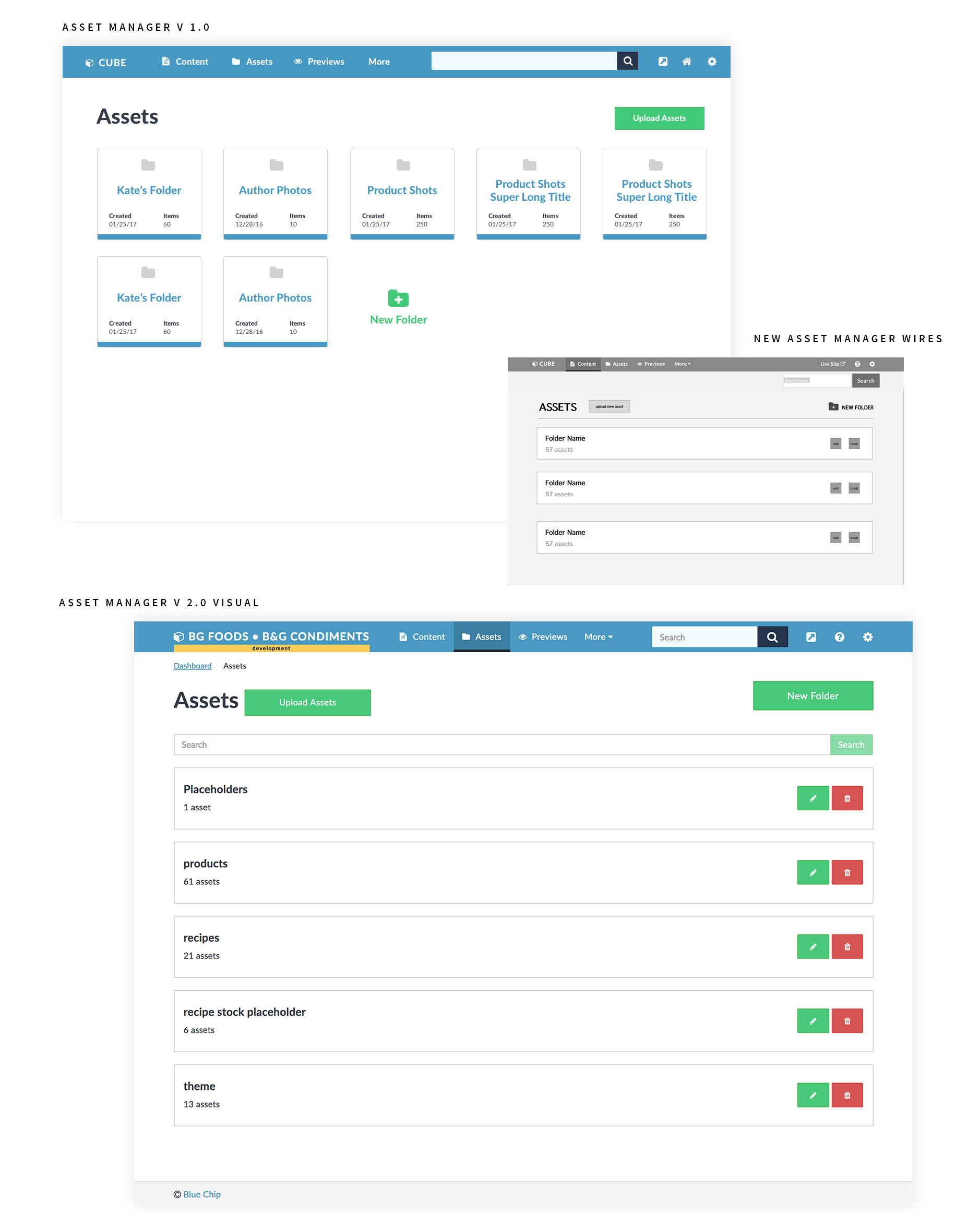
When the product was originally built, there was a very simple asset manager that basically amounted to uploading all of the content assets into a single repository that displayed as a long list of items. It quickly got very long and became hard to use. So we re-hauled the entire Asset section.
We started with mapping out the flows of the two main ways that a user adds an asset to a post:
1. They batch upload multiple images at once, to use later.
2. They add or upload a single asset to a single post while they are editing that post.
When a user adds an asset to a single post, they have the choice to upload it from their desktop, or choose an asset that already exists in a folder.
We created wires to guide us through the flow of adding an asset to a post. We originally had search out in the side navigation with “Upload” and “Files”, but after implementing, we found that placing search within the “Files” tab made more sense, because it was part of that workflow, because it was searching the files. This helped clarify the two sources of assets- choose already existing asset or upload new asset.
Below is a recording of the finished flow of adding an existing image to a recipe post via the Asset Manager.
When we thought about how to group the folders on the asset page itself, we first had them as rows of cards in a grid. We did some user testing and got feedback that the grid was hard to navigate and find specific folders. It also contained information that no one found particularly helpful, like the folder creation date.
So we redesigned them as simple rows, with the title and number of items in the folder very clearly displayed and easy to see. The user can click the row itself or click the edit icon to go into the folder and see the titles of the specific assets within that folder.
We kept the ability to quickly add assets, as well as create a new folder, at the top, where they are easy to find and use.
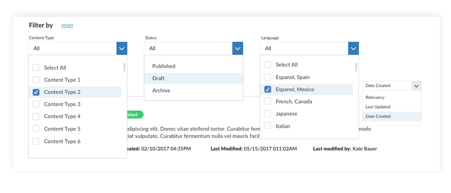
When we set out to redesign the Search results page, we knew that we needed to include several filters, but we didn’t want to use so many that the user got overwhelmed. So we did some user testing and narrowed the important ones down to Content Type, Status, and Language. (Language was a filter that could be modified for use depending on the site’s needs- it could be changed out to User/Author if that worked better for the user.)
We also built Sorting functionality, which included options to sort by Date Created, Last Updated, and Relevancy.
On the search results themselves, it was important to create a very structured hierarchy, because we wanted to include so much information. We especially wanted to make it clear to the user whether or not the post was Published, in Draft mode, or Archived, so we highlighted those with specific colors. The globe icon indicates that the post contains several language versions.
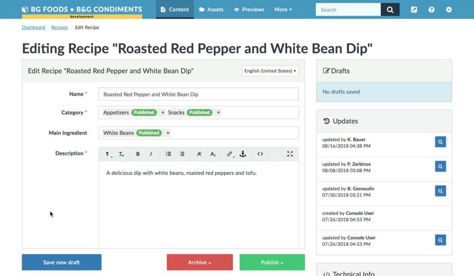
Because we were focused on the major UX issues that needed to be fixed for the CUBE 1.0 release, we couldn’t spend a lot of time refining the UI. But it needed to be improved. So we worked with some of the existing structure and design, and brought in design impact with typography adjustments, establishing page hierarchy, and bringing in a lot of white space to help the pages breathe and be much easier to scan and find information.